Graph Displaying
The count rate and dose rate graphs display data and function in the same manner.
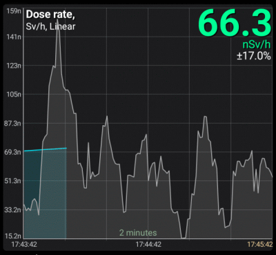
If the graph shows the most recent data in real time, then on the right, in gray, is the operational data read by the device from its sensor, which has not yet been processed (data processing and filtering algorithms need to accumulate a certain amount of data). Already processed and filtered values are displayed on the graphs in green/blue. Live data is stored for the last 10 minutes.
You can control the live data filter displayed on the graph. You can set the width of the filtering window in the graph settings, which determines the time over which the data is averaged.This averaging is performed by the device and serves only to display operational dataand is not related to data processing by the device, which calculates the values displayed by the color graphs.
On the dose rate graph, vertical colored lines with a circle at the top indicate the moments when alarms occurred. These lines can be disabled in the graph settings.
Scale selection
The data can be shown in linear, logarithmic, and quadratic scales. The current scale name is displayed at the top left of the graph; in this example, it is the square root.
The scale can be changed either directly in graph settings, accessed via the  button, or by double-tapping the graph. You can set a custom scale for each graph.
Y-axis zooming
By default, the displayed plot area fills the entire visible window along the Y axis. The horizontal grid consistently has 8 cells, and the digitization values are dynamically calculated based on the displayed data. It should be noted that two additional points are considered when determining the maximum and minimum values of the visible area: one beyond the left border and one beyond the right.
You can choose automatic scaling along the Y-axis for both the current visible area and the entire range of data available to the application in the graph settings. Each graph (count rate, dose rate) has its own setting.
Graphs can be moved along the Y-axis (up/down) by swiping your finger across the screen. To switch from automatic scaling to manual scaling, you initially need to move the graph up or down with enough force to prevent accidental shifts during paging. Once this is done, automatic scaling is disabled, allowing you to precisely position the graph with gestures to, for example, determine the values at peaks.
Using the pinch gesture on the screen, you can enlarge and reduce graphs both vertically and horizontally. When pinching vertically, the auto-zoom mode is also disabled.
The “A” button serves as both an indicator of the current zoom mode and a way to return to the last selected auto zoom mode. The icon on the button represents the selected mode:
| Icon | Description |
|---|---|
| Automatic scaling across the visible area. |
| Automatic scaling across the entire data range. |
| Manual zoom. Tapping the button returns to the last auto-scaling mode selected in the settings. |
| Both graphs are displayed on the screen, but their scaling modes do not match. Tapping the button restores the last autoscaling mode selected in the settings for each graph. |


In graph settings, you can disable the transition to manual scaling mode. In this case, attempts to shift the graphs and pinch along the Y-axis are ignored, and the “A” button is highlighted in red.
X-axis zooming
Graphs can be scaled along the X axis (time axis) by using the  and
and  buttons, or by performing a pinch gesture. A long press on the button will increase the zoom to the maximum or decrease it to the minimum.
Scrolling
Scrolling graphs horizontally can be done using standard gestures, as well as the  and
and  buttons. These buttons locate the previous or next data segment after a time gap.
A long press of the button moves to the very beginning or, conversely, to the very end of the graph. The data is displayed in specific portions. When the limit is reached, a new set of data is loaded from the database.
Updated: Jan 9, 2026