Overview
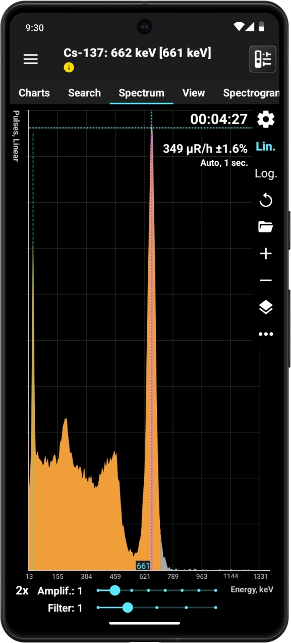
Phone with collected spectrum
This window shows the energy spectrum of photon (gamma and X-ray) radiation, recorded by the device over a specific period. When you connect the device to the smartphone, the app retrieves the spectrum data from the device. The spectrum graph is then updated either automatically at the interval set in the settings or manually.
In the top right corner of the graph, you can see:
- the duration for which the spectrum data was collected, in the HH:MM:SS format.
- The average pulse count rate, which is the total number of pulses across all channels divided by the data accumulation time.
- Average dose rate of X-ray and gamma radiation during the spectrum accumulation period.
- X-ray and gamma radiation dose during the spectrum accumulation time.
- How the graph is updated, or for the View Spectrum window.
In the mode of displaying the graph showing the difference between the spectrum and background, the values of the count rate and dose rate will equal the difference between these values for the spectrum and background. The accumulated dose is calculated using the formula (Ds - Db) * Ts, where Ds is the spectrum dose, Db is the background dose, and Ts is the spectrum accumulation time. In difference mode, spectrum information is displayed in italics as a reminder.
The display of each item, except for the last one, is controlled by its corresponding setting. Unnecessary data can be turned off to save screen space.
The section of the graph where the spectrum's shape is considered unreliable, due to the small number of accumulated events, is shaded in gray.
Depending on the settings, the X-axis can show either channel numbers or photon energy. The Y-axis can display either the number of pulses or the count rate. The Y-axis scale can be linear or logarithmic.
| Button | Description |
|---|---|
| Opens the settings for the spectrum graph. |
Lin | Select the linear scale for the Y-axis. |
Log | Select the logarithmic scale for the Y-axis. |
| Refresh the spectrum data. The application retrieves the current data from the device and updates the graph, regardless of whether the update method selected in the settings is manual or automatic. |
| Open spectra library. |
| Zoom in on the graph. You can scroll the graph horizontally. A long press on this button will increase the zoom to the maximum level. The current scale value is shown in the lower left corner of the screen. |
| Zoom out. Press and hold this button to reduce the scale to one. |
| Open the dropdown menu. The menu contains available actions:
|


Tapping the graph at a display scale of x1 displays the cursor lines. The vertical line, corresponding to the position on the X-axis, can be moved by tapping the screen at the desired point or by sliding your finger across the screen. The horizontal line automatically aligns with the position of the pointer on the X-axis.
To display marker lines at a scale greater than x1, long-press the screen, and the marker lines will appear. Move the vertical line left and right without lifting your finger from the screen.
If marker lines are present, a "magnifying glass" ("zoom") is displayed by default in the lower corner of the spectrum graph. This is a small window where a section of the graph corresponding to the vertical marker line is visible at an enlarged scale. The magnifier allows you to position the marker lines on the peaks more precisely. In the spectrum settings, you can set the position of the magnifier on the chart or turn it off.
Quick double taptoggles the display mode between linear and logarithmic.
At the bottom of the spectrum window, there is a slider that controls the “enhancement” of a histogram.
A curve of the following type is overlaid on the graph:
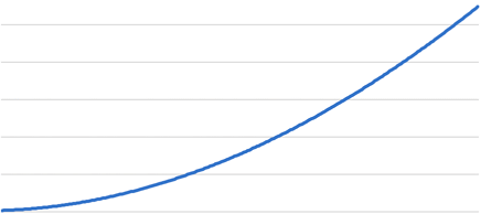
This enables subtle peaks to appear on the graph. For each channel, the value is calculated using the formula Vn = Vn An F + 1, where:
n - channel number
Vn - spectrum value (number of pulses or count rate) in channel n
An - value at the corresponding point of the amplifying curve
F - gain factor, adjustable by the slider, ranging from 0 to 5.
In amplification mode with F >= 1, the Y-axis digitization is not displayed.
Filter Engine applies a smoothing algorithm to the spectrum graph. The higher the filter value, the smoother the graph becomes.
The spectrum graph is also available as a widget.
Updated: Jan 9, 2026