Overview
The "Search" mode is designed to analyze the device's operational ("raw") data and identify sources of radiation or variations in radiation fields. The data is presented in various graphical formats for two measurement channels: count rate and/or dose rate.
The operational data consists of raw gamma radiation information sent from the device to the application in real time every 500 ms. The application retains this data for the last 10 minutes. The values of the operational data vary significantly and are characterized by a high degree of random measurement error. As the level of recorded radiation increases, this error decreases.
The  button, when held or pressed, lets you choose one of three display options:
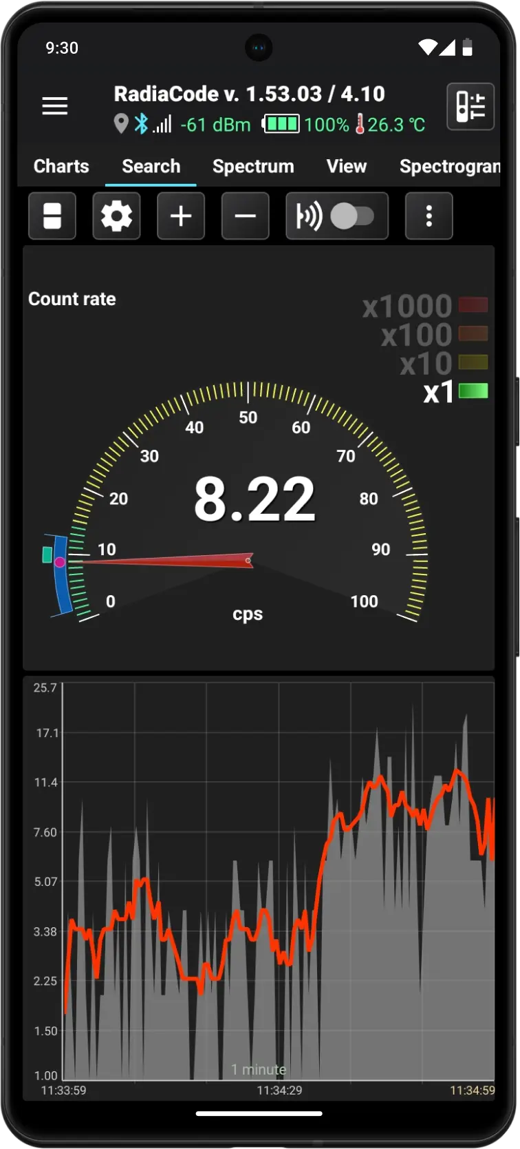
- The count rate is displayed as an arrow indicator and a graph
- Dose rate displayed as an arrow indicator and a graph
- The count rate and dose rate are displayed as arrow indicators
Graphs consistently show operational data exactly as it is received from the device, without any processing. The data shown on the arrow indicator is averaged: the arithmetic mean is calculated over a time interval that can be specified in the settings.
Analog arrow indicator
The indicator is a fixed linear scale with divisions from 0 to 100 and an arrow. The scale is colored according to the alarm thresholds set in the dosimeter (see Device settings). To obtain readings corresponding to the arrow's position, multiply the value on the scale by the coefficient active in the list to the right of the indicator.
At the center of the arrow indicator is a numeric value that shows the current data value. The units of measurement are located beneath the indicator. The name of the measured value is displayed in the upper left corner. A bright circle marker at the end of the arrow enhances contrast.
There are two dynamically changing zones along the circumference of the indicator scale. The blue statistics area shows the maximum and minimum range of values recorded since the application was launched or since the statistics were reset.
The cyan zone above the blue one shows the oscillation range of the arrow, with boundaries that dynamically indicate the activity zone and the direction of the arrow's movement.
Graph
The graph displays the operational data from the device. It resembles the graphs on the "Charts" tab and includes the following features:
- Time scales range from 1 to 10 minutes.
- The Y-axis scale can be linear, logarithmic, or square root.
- Scale the graph along the Y-axis over the entire range (up to 10 minutes) or over the area visible on the screen. Manual scaling is not available.
- The right edge of the graph always aligns with the current moment in time.
Touching the graph displays a horizontal line that can be moved to accurately determine the value shown on the graph.
Control buttons
| Button | Description |
|---|---|
 | Switches the displayed charts and indicators in various combinations. A long press on this button opens a drop-down menu where you can select the desired combination from the list. |
 | Opens the settings for "Search" mode. |
 | Adjust the time scale. A long press of the button will either zoom in to the maximum or zoom out to the minimum. |
 | Enables or disables smartphone playback of clicks corresponding to the count rate. Additional click options are available in the Application Settings. |
 | Open the drop-down menu. The following actions are available in the menu:
|
Updated: Jan 9, 2026