Overview
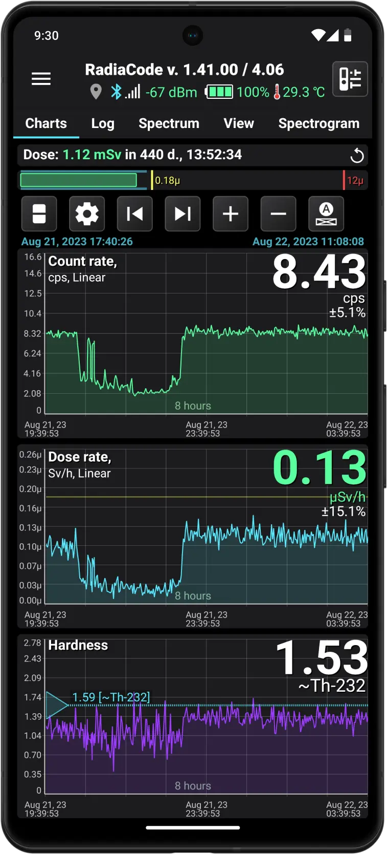
Main Screen Overview
Screen fragments
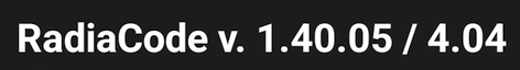
The application name and its device firmware version (if connected). If an app update is available on Google Play, the version number will be highlighted in yellow.
The device firmware is integrated into the application itself, allowing the app to recognize both versions.
The device may have a newer firmware version than the one the application is designed for. This can occur if the device firmware has been updated using the Radiacode Windows app, but the Android app has not yet been updated.
In this situation, the firmware number appears in red, indicating that the application needs to be updated. Otherwise, we cannot ensure the app will function correctly.
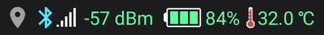
Current status of the device and application: location, status, and strength of the Bluetooth signal, as well as device temperature.
If the location icon is gray, it means the app does not record the current location to the database. This could be because the option is disabled in the app settings or because determining the location is not possible.
Tapping the  icon opens the application's main menu.
The  at the top of the screen opens a dialog window for quick device settings, such as sound control, light indication, vibration, etc.
The  at the top of the screen becomes visible and blinks when the alarm threshold is exceeded (if the device sounds are enabled). Tapping this button mutes the alarm until either a higher-level alarm occurs, or the alarm ends and reappears. The same action can be performed by pressing the round button on the device body.

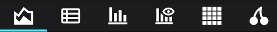
Application page switcher. In addition to the main page, there is also a page for viewing logs, a page to display the spectrum, and the spectrogram (other modes may also be available in this menu). Pages can be switched by tapping the page title.
In the application settings, you can choose to display either text or icons as bookmark headers. Icons might be more convenient because they all fit on the same screen:

The accumulated emission dose value over the specified time interval. On the right side of this field, there is a button to restart the dose accumulation (resetting the accumulated dose value to zero).
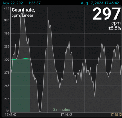
Pulse count rate graph. The start and end date/time of the data section loaded into the application's memory from the database are displayed in blue at the top of the graph. This portion of the data is available for display in the graphs.
At the top right, the current count rate is displayed—the number of emission pulses recorded by the device's sensor per second or per minute, depending on the selected settings.
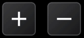
The time scale is shown above the X-axis, and on the graph, it is set to 4 minutes. This means the graph displays data for 4 minutes. You can adjust the scale using the “+” and “-” buttons next to the graph, or by using the pinch gesture. For more details, see Graph displaying.
The X-axis shows the calendar time corresponding to the start and end of the graph. If the time is for the current day (“today”), the date is not displayed; otherwise, the date will appear above the time.
If the graph shows the most recent data corresponding to real-time, then on the right, in a lighter color, live data is displayed. This data has been read by the device from its sensor but has not yet been processed, as data processing and filtering algorithms require a certain amount of accumulated data. Processed and filtered values are displayed in green on the graph.
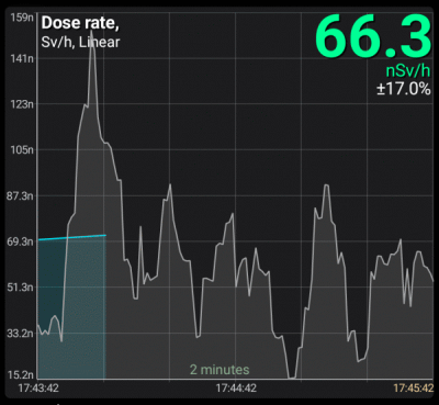
The dose rate graph displays the units of measurement as selected in the device settings. When an alarm is triggered, the dose rate value is shown in a color that corresponds to the alarm.
The alarm levels are shown with horizontal colored lines.
Vertical colored lines with a circle at the top indicate when alarms occurred.
The white vertical lines indicate the records where a comment is set. If you position the white line precisely in the middle of the graph, a window displaying the comment text will appear. You can set a comment either through the drop-down menu that appears when you long-tap the chart, or via the "Log" tab.
The dose rate graph is synchronized in time with the count rate graph.
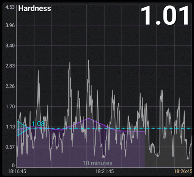
Graph of radiation hardness. It is derived from log data and operational data (gray zone), allowing you to estimate the conditional radiation hardness for a specific device model. It is displayed as a dimensionless coefficient, calculated as (μrem/h)/(cps).
The rigidity of the radiation indicates which energies dominate the spectrum and allows you to concentrate on spectral changes, eliminating the intensity component.
The hardness coefficient will display correctly if the device firmware is version 3.0 or higher.
By adjusting the triangle on the left edge of the window, you can estimate which isotope roughly corresponds to the selected hardness.

Switches the displayed graphs in various combinations. A long press of this button opens a dropdown menu where you can choose the desired combination of charts from the list. The same can be achieved through the graph settings dialog.

Opens the graph settings.
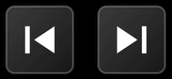
Look for the previous or next data point after a time gap.
A long press of the button moves to the very beginning or, conversely, to the very end of the graph.
Adjust the time scale as needed.
A long press of the button increases the zoom to the maximum or decreases it to the minimum.

Scaling mode indicator and return to the automatically selected scaling mode in the graph settings.
See Graph Display.

Animated diagram of the current dose rate value with alarm levels. The blue zone shows the boundaries where the dose rate value was during the time interval specified in the graph settings. If you select the "Last .... minutes" option, the blue zone boundaries are updated every minute. If the real-time dose rate value from the device exceeds the current limits, the limits are updated according to the current value.
A long press on the graph displays the marker lines. You can move the vertical line by dragging the touch point along the graph or by using the smartphone volume buttons, if this is permitted in the application settings. The horizontal line automatically aligns with the position of the pointer on the X-axis. In marker lines mode, the button is replaced with the Option button, which opens a drop-down menu (if there is data in the database corresponding to the touch point):
- Add a text comment for the selected point. The comment is displayed in the log.
- Display the selected section in the log. Please note that the log might not show the entry related to the tap point because of the filters set in the log settings.
- Open the map to pseudo track with data corresponding to the moment selected on the graph.
- Manage the image attached to the point.
If several Radiacode devices are connected to the application, the readings from all these devices are stored in the database. However, at any given time, data from only one device is displayed on graphs and in the log. If a device is connected to the application, the data from that specific device is displayed. If the device is not connected and there are readings from multiple devices in the database, you can choose which device's data to display in the "Log" tab.
Updated: Jan 9, 2026