Overview
Overview of Dose Mode
Before using this mode, ensure your device firmware is updated to version 4.13 or higher.
The "Dose" tab is intended for:
- Monitoring the accumulated dose over a specified time interval;
- Observations of the accumulated dose over fixed time intervals using charts;
- Predicting the dose that will be received by analyzing the data from the device for the specified time interval;
- Information on dose levels that are hazardous to human life.
When using the "Dose" tab, please consider the following:
- All the data displayed on this tab is accurate only for situations where the device and you were in the same conditions concerning the sources of radioactive radiation. For instance, if the activity of a sample in a container was measured, the dose accumulated by the device will be greater than that received by your body.
- If the device is turned off, it does not perform any measurements, and all data on the accumulated dose, as well as forecasting data, may be inaccurate compared to the dose actually accumulated by your body. A similar situation will occur if part of the data has been deleted from the database through the local menu of the Log tab.
To use the "Dose" tab, ensure that the Radiacode device firmware is version 4.13 or higher.
The dose shown at the top of the Charts tab does not influence the data displayed on the Dose tab. Resetting the dose accumulation in the device also does not impact this data. To maintain the data on the "Dose" tab, the device has an independent, non-resettable dose counter.
The resolution of the device's dose counter is 10 μR (0.1 μSv), meaning the dose data is recorded by the device and transmitted to the application when the accumulated dose increases by 0.1 μSv or more. At background radiation levels, the frequency of data recording can vary significantly, ranging from a few minutes to several hours.
All calculations are based on the dose counter values stored in the database. When the dosimeter connects to the application, the accumulated data from the device is read and stored in the application log.
Screen fragments
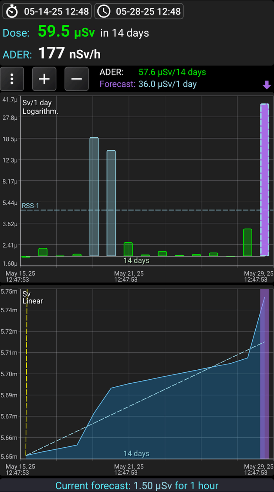
Cumulative dose panel
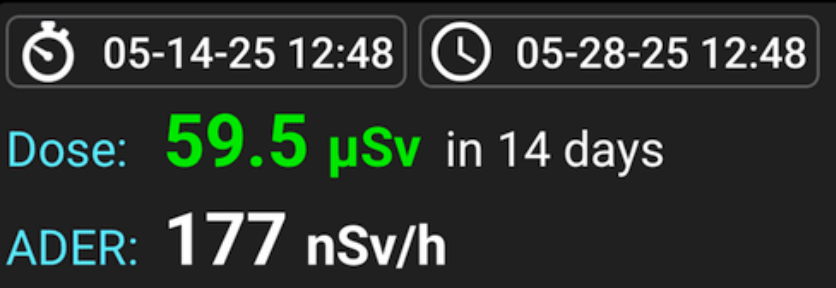
Dose: The dose accumulated by the device over the specified time interval. The color of the value indicates the alarm level on the alarm scale. The left button sets the start, and the right button sets the end of the time interval for which the accumulated dose is displayed.
When choosing the end of the interval, you can specify that it always corresponds to the current moment or select a fixed date.
When choosing the start of an interval, you can specify that it is separated from the end by a chosen duration (ranging from 30 minutes to 1 year), or you can select a fixed date.
If the end interval corresponds to the current moment (the default), the dose accumulated up to that moment will be displayed. Meanwhile, if the initial interval is separated from the final one by the selected time, you will have a sliding window linked to the current moment. If the start interval is fixed for the selected date, the window will automatically expand over time.
ADER: Dose rate, i.e., the value in the "Dose" field, recalculated to 1 hour. It allows for estimating the average dose rate over the accumulation interval.
 opens the dropdown menu.
- Settings: Opens the measurement and display settings for the Dose tab.
- Color scale: Displays a table with the alarm scale.
- Show Charts:Opens a submenu where you can choose which graphs to display on the Dose tab.
 Buttons adjust the time scale for graphs. Long press the button to extend the scale to the maximum or reduce it to the minimum.
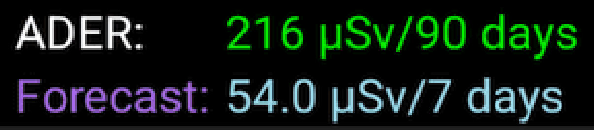
The top line represents the dose value accumulated over the entire interval shown on the interval dose graph (in the picture - 1 month). This interval will change as you scroll through the graph.
The bottom line represents the dose forecast that will accumulate for a single graph reading (as shown in the picture - 1 day). This value is calculated by converting the dose value for the forecast interval to the reading time interval. For example, if the forecast interval is 12 hours and the dose value is 3 mR, then the forecast for a reading of 1 day (24 hours) will be 6 mR. For more information on the interval and how the forecast is calculated, see here.
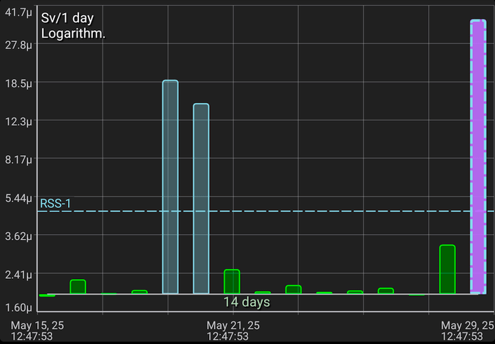
Interval dose graph as a histogram
Each column (reading) shows the dose accumulated over a fixed interval (in the picture - 1 day). The color of the bar corresponds to the alarm level value on the alarm scale. The rightmost pink bar represents the forecast for the reading interval (see above). The forecast will be non-zero only if the device is connected to the application.
The interval dose graph shows horizontal dashed lines indicating dose alarm levels, normalized to the intervals on the graph. These lines help you determine if the dose alarm has been exceeded for any interval. Dose alarms are considered exceeded if the accumulated dose over a year surpasses the threshold. For instance, on the graph, each bar represents 1 day, and each alarm line indicates the daily dose level required to reach the corresponding annual dose alarm.
The bases of the bars are aligned with the line representing the background level. The value corresponding to the background level can be set in the dose settings. If the reading value is greater than the background level, the bar will point upwards; if less, it will point downwards. This allows you to visually emphasize significant readings.
If the dose value for the reading is below the level specified in the dose settings, a symbol is drawn instead of a bar.
The horizontal lines represent the values of the dose alarm levels.
The time scale is shown above the X-axis, and on the graph, it represents 1 month. This means the graph displays data for 1 month. You can change the scale using the '+' and '-' buttons above the graph, as well as the "pinch" gesture.
The calendar time for the start and end of the graph is shown below the X-axis. If the time is for the current day ("today"), the date is not displayed; otherwise, the date will also appear above the time.
The data on the Y-axis can be displayed in various scale options: linear, logarithmic, and quadratic. The name of the current scale is shown at the top of the graph; in this example, it is a linear scale. You can change the scale either directly in the dose settings, accessed via the button, or by double-tapping the graph.
When displayed, the scale on the Y-axis is automatically selected based on the levels of readings visible on the graph.
A long press on the graph displays the marker lines. You can move the vertical line by dragging the touch point along the graph. The horizontal line is automatically positioned on the Y-scale at the location corresponding to the pointer's position on the X-axis.
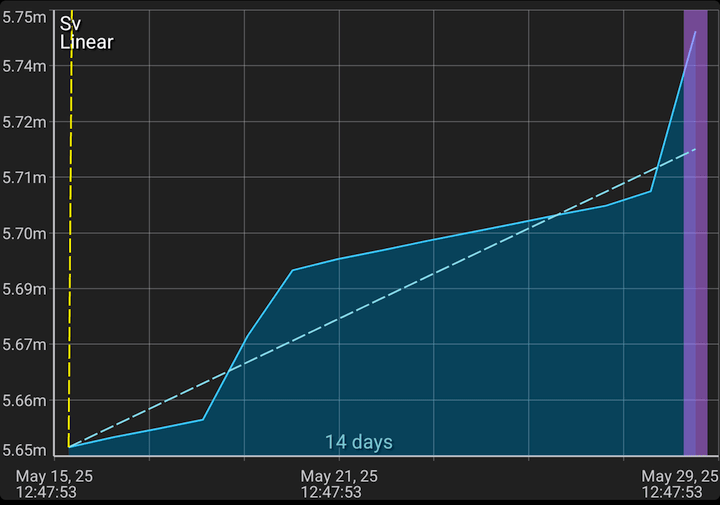
Dose graph
This graph shows the dose counter values stored in the database. The start and end of the displayed interval, as well as the scale on the X-axis, are synchronized with the interval dose graph, just as they are for the graphs on the "Charts" tab.
The dose graph shows dashed alarm lines, which represent dose accumulation at a linear rate. These lines indicate how the dose must accumulate to exceed the 1-year dose alarm threshold.
A long touch on the graph displays the marker lines. You can move the vertical line by adjusting the touch point on the graph. The horizontal line automatically aligns with the pointer's position on the X-axis.

This is how a Dose forecast for the interval specified in the settings looks like. This interval can be calculated automatically by the application or set manually.
Calculating the dose per interval
The dose counter data is stored in the database as pairs of "time" and "dose" values. The time intervals between adjacent readings vary. The data may contain gaps, and the device might have been turned off during these gaps. Additionally, the database may include data from different Radiacode device samples, and this data may even overlap in time.
When displaying graphs, the program must determine the dose values for fixed time intervals that do not match the intervals between the data in the database. To achieve this, special algorithms are used to perform value interpolation.
Using the "Dose" tab
The cumulative dose panel can be used to automatically calculate the received dose and estimate the average dose rate. By observing the color of the received dose and comparing it with the color scale, you can determine whether the dose alarm has been exceeded. Please note that the alarm for RSS is considered exceeded only if the interval is 1 year, as the radiation safety standards are adjusted to the annual interval. If the dose is exceeded only for a short time interval, and not for a year, this can be considered a normal situation.
The interval dose window helps you understand how the received dose changes over days, weeks, and months. If it exceeds one or more dose alarm levels, it indicates that the device was exposed to radiation during that time. To accumulate a dose level above the alarm, all intervals must exceed the alarm line on a one-year scale. You can also use the cumulative dose panel to obtain this information.
The dose window helps you understand how the device accumulates the dose and displays a graph of this accumulation. The interval dose window graph can be viewed as a derivative of the dose window graph. The alarm lines indicate how the dose will accumulate to surpass the threshold. The threshold is considered exceeded if the graph line is above the alarm line. You can also pay attention to the position of the alarm lines. If the alarm line rises steeply, it indicates that such a dose is difficult to achieve. The lower the alarm line is on the graph, the higher the likelihood of accumulating a dangerous dose level.
To evaluate the accumulated dose and compare it with the standards, you need to select an annual interval. In this case, any alarm levels that end below the graph level will be considered exceeded.
Updated: Jan 9, 2026